Landing page best practices for ads
How to turn more of the people you pay to bring in into customers and enquiries.
Book a call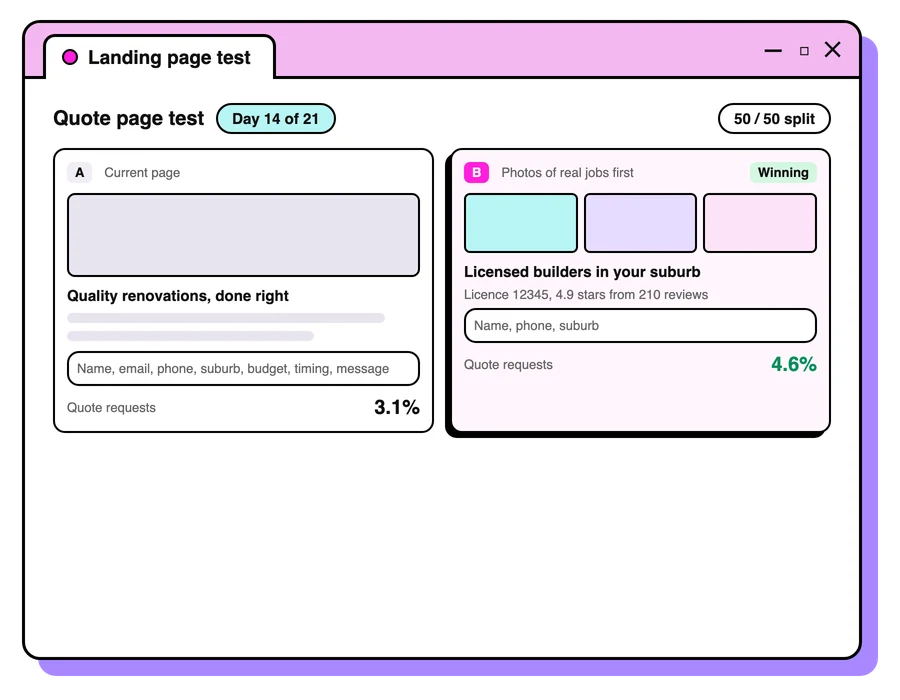

Landing page best practices are the habits that turn more of your ad clicks into enquiries and sales: match the headline to the ad, put the offer and one clear call to action on the first screen, load fast on a phone, show proof near the button, ask only for the details you need, and test changes once you have the traffic. A landing page is the page someone lands on after clicking your ad. Improving it is one of the cheapest ways to grow, because a better page lifts the return on every dollar you already spend to send people there.
The maths is simple. If you double your ad budget, you rarely double your results; as Michelle Bourke, our founder, has put it, “Usually what happens is you double your spend and then your conversion rate halves”. Double the conversion rate of your page instead, and every visitor you already pay for is worth twice as much. Better still, the improvement helps visitors from search, email and social too.
Start with your customer
Best practices are a good starting point, but the page has to suit the people you're selling to. Before you change anything, find out what's stopping them. Read your sales calls and emails, ask a handful of recent customers what nearly put them off, and watch recordings of real visits with Microsoft Clarity, which Microsoft offers free, to see where people hesitate, rage-click or leave.
What makes a good landing page
Match the headline to the ad
The headline should say what the ad promised. Someone who clicked "Same-day blocked drain repairs" should land on a page that says exactly that, with the suburb if you can. Google rates this too: landing page experience in Quality Score measures "how relevant and useful your landing page is to people who click your ad".
Make it clear above the fold
The first screen does most of the work. Say what you offer, who it's for and what to do next, with one main call to action. If a visitor has to scroll to find out what you do, many won't.
Keep it fast
Most ad clicks come from phones, often on patchy mobile data. Google's Core Web Vitals give you clear targets: the main content should appear within 2.5 seconds, the page should respond to a tap within 200 milliseconds, and the layout shouldn't jump around as it loads. Compress images, cut scripts you don't need and test the page in PageSpeed Insights before you send paid traffic to it.
Show proof
Reviews with names, star ratings, logos of businesses you've worked with, guarantees and real photos all answer the question "Can I trust them?". Put proof close to the button.
Keep the form short
Every field on a form costs you enquiries. Ask only what you need to follow up well. For lead generation, one or two qualifying questions, such as timing or budget, can be worth the slight drop in volume because your team spends its time on better leads.
Give people a nudge
A clear reason to act now helps: a limited offer, an upcoming date, free delivery over a threshold, or simply "We'll call you back within the hour".
Landing page checklist
- Headline matches the ad and the search
- What you offer, who it's for and the next step are all on the first screen
- One main call to action, repeated as people scroll
- A tap-to-call number for mobile visitors
- Reviews or other proof near the button
- A short form with only the questions you need
- Loads quickly on a phone
- Conversion tracking firing on the thank-you page or event
When to A/B test, and when to just ask
A/B testing needs enough traffic to trust the result. As a rough guide, testing works well once a page gets tens of thousands of visits a month and hundreds of conversions. Below that, a test can run for months without a clear answer. You'll learn faster by showing the page to five customers and asking what confuses them.
When you do test, change one thing at a time, start with the biggest elements (headline, offer, first screen), and run each test for at least a couple of full weeks so weekday and weekend visitors are both counted.
Want us to look at yours? Landing pages are part of every Google Ads and Meta ads account we run.
Landing page best practices for mobile
Most people who click your ad will see the page on a phone, so design for the phone first and check the desktop version second. A page that looks tidy on a laptop can turn into a long scroll of tiny text and stacked images on a small screen.
- Put the headline, the offer and the main CTA on the first phone screen, with no zooming needed.
- Make buttons big enough to tap with a thumb, with space around them so people don't hit the wrong one.
- Use the right keyboard for each form field: a number pad for phone numbers and an email keyboard for email addresses.
- Add a sticky CTA bar or tap-to-call button that stays on screen as people scroll.
- Keep pop-ups to a minimum. On a phone they can cover the whole page, and people close the tab instead of the pop-up.
- Test on a real phone over mobile data, as well as in your browser's phone preview.
Google pays attention to this too. Landing page experience is one of the three parts of your Quality Score in Google Ads, alongside expected clickthrough rate and ad relevance. It reflects how relevant and useful your page is to the people who click your ad.
Write a CTA that says what happens next
Your call to action (CTA) is the button or link that asks people to take the next step. Words like "Submit" or "Click here" tell the visitor nothing. A strong CTA says what they get and what happens after they tap.
- "Get my free quote" names the reward.
- "Book a 15-minute call" sets a clear expectation about time.
- "See prices for South Melbourne" matches what a local searcher wants to know.
Keep one main CTA per page and repeat it as people scroll, so it's always close by when they're ready. A secondary option, such as a phone number for people who'd rather talk, works well as long as it doesn't compete with the main CTA for attention. Make the CTA button the strongest colour on the page, with button text that meets the WCAG contrast minimum of 4.5:1 against the button, and add a short line of reassurance right under it, such as how quickly you reply, as long as it's true for your business.
Use social proof and trust signals
Social proof is evidence that people like your visitor chose you and were glad they did. Trust signals are the details that show you're a real, safe business to deal with. Both answer the doubts that stop people acting, so match each piece of proof to a doubt.
- "Will this work for someone like me?" Reviews from customers in a similar situation, with their first name and suburb if they've agreed.
- "Are they any good?" Your Google star rating and number of reviews, awards, and logos of brands you've worked with.
- "What if it goes wrong?" Guarantees, warranties, refund terms and clear contact details, including a street address if you have one.
- "Is it safe to share my details?" Recognised payment logos, a short privacy note beside the form, and your ABN in the footer.
Specific proof persuades more than vague praise. A review that describes the job and how it went does more work than "Great service!". Use real reviews word for word, with the customer's permission, and update them so the newest ones show first.
Optimise your images
Images do a lot of the selling, because a photo of your real work answers questions before people read a word. They're also one of the most common reasons a page loads slowly, so every image needs to earn its place and be as light as it can be.
- Use real photos of your work, your team and your products. Visitors spot stock photos quickly, and they add little trust.
- Resize each image to the largest size it will display at, then compress it. Modern formats such as WebP keep the quality at a smaller file size.
- Set the width and height of each image so the page doesn't jump around as it loads.
- Load images further down the page only as people scroll to them (lazy loading), and keep the main image on the first screen loading straight away.
- Give each image a short, plain description in its alt text. It helps people using screen readers, and Google uses it to understand the image. Google's image SEO best practices cover the rest.
Personalise the page to the visitor
The closer a page feels to what someone searched for or saw in the ad, the more likely they are to act. Most of this needs no special software.
- A page per offer or audience. Say a South Melbourne physio runs ads for sports injuries and for back pain. Two pages, each with its own headline, photos and reviews, will speak to each group far better than one page trying to cover both.
- Headlines that match the search. Some landing page tools can swap the headline using a value you add to the ad's link, so someone searching "emergency plumber" sees a headline about emergency plumbing.
- Make buttons big enough to tap with a thumb, with space around them so people don't hit the wrong one. The accessibility standard WCAG 2.2 sets a minimum target size of 24 by 24 CSS pixels; your main CTA should be well above that.
- Returning visitors. People who have already enquired or bought need less introduction. Point remarketing ads to a page that picks up where they left off, such as an offer to book again.
Keep personalisation to what helps the visitor. A headline that matches their search feels helpful; details they didn't expect you to know feel intrusive.
Build a testing routine
Once your page has the traffic to test, the gains come from a steady routine, with each test building on the last. A simple five-step loop keeps tests focused on real problems and stops your team testing button colours at random.
- Write down a problem you've seen in recordings, customer feedback or your numbers.
- Turn it into a hypothesis, for example: "If we put the price on the first screen, more people will enquire, because price is the first question on our sales calls."
- Decide the measure that counts, such as enquiries, sales or qualified leads, before you start.
- Run the test until you have enough conversions to trust the result, then keep the winner.
- Record every result, including the losers, in a simple test log, so you never repeat an old test and each new idea builds on what you've learned.
In Google Ads, a custom experiment shares a campaign's traffic and budget between your current setup and a trial version, so you can send part of your traffic to the new page and compare the two fairly over the same weeks.
How much is a better landing page worth?
A better landing page is worth as much as the extra enquiries it brings from clicks you already pay for, and the sums are simple to run on your own numbers. Here's a worked example with made-up figures for a hypothetical South Melbourne physio clinic.
- Today: $3,000 a month on Google Ads at an average cost per click of $3 buys 1,000 clicks. If 4% of visitors book, that's 40 bookings at $75 of ad spend each.
- After a better page: the same $3,000 and the same 1,000 clicks. If the new page lifts bookings to 6%, that's 60 bookings at $50 each.
- The same result from more spend: getting 60 bookings from the old page would take about $4,500 a month, if extra clicks converted as well, which they rarely do.
That's why we look at the landing page before we raise a budget. Work out your own figures with our cost per lead calculator, then decide whether the next dollar should go into ads or into the page.


Questions people ask
What is a good landing page conversion rate?
It varies a lot by industry, offer and traffic source. Compare your page against its own past results and other pages on your site, and focus on improving it rather than hitting an average.
Should my landing page have navigation?
For paid traffic, fewer distractions usually helps. Keep a simple header so people can trust who you are, but make the main call to action the obvious next step.
How long should a landing page be?
As long as it takes to answer the questions people have before they act. A simple, cheap offer needs little; a big purchase needs more proof and detail.
Do I need a separate landing page for each ad?
Not for each ad, but each distinct offer or audience deserves a page that speaks directly to it.
What is a CTA on a landing page?
CTA stands for call to action: the button or link that asks visitors to take the next step, such as "Get a quote" or "Book a call". The best CTAs say what the visitor gets and appear more than once as they scroll.
Does my landing page affect my Google Ads results?
Yes. Landing page experience is one of the three parts of Quality Score, Google's rating of how relevant your ads, keywords and landing pages are. A more useful page also turns more of the clicks you pay for into enquiries, which lowers your cost per lead.
What should a landing page include?
A headline that matches the ad, a clear offer, one main call to action, proof near the button, a short form or tap-to-call number, and fast loading on a phone. Use the checklist on this page to review yours.
Keep reading
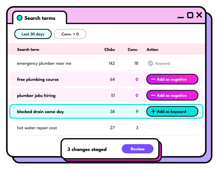
Google Ads search terms report
How to use the Google Ads search terms report to find new keywords, cut wasted spend and win more of the traffic that turns into enquiries.
Read the guide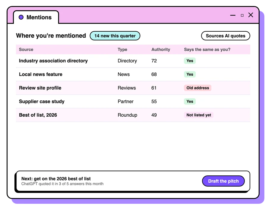
What are backlinks?
What are backlinks, how Google and AI tools use them, and what makes a good one. A plain guide from Foresight Digital, a Melbourne SEO agency.
Read the guide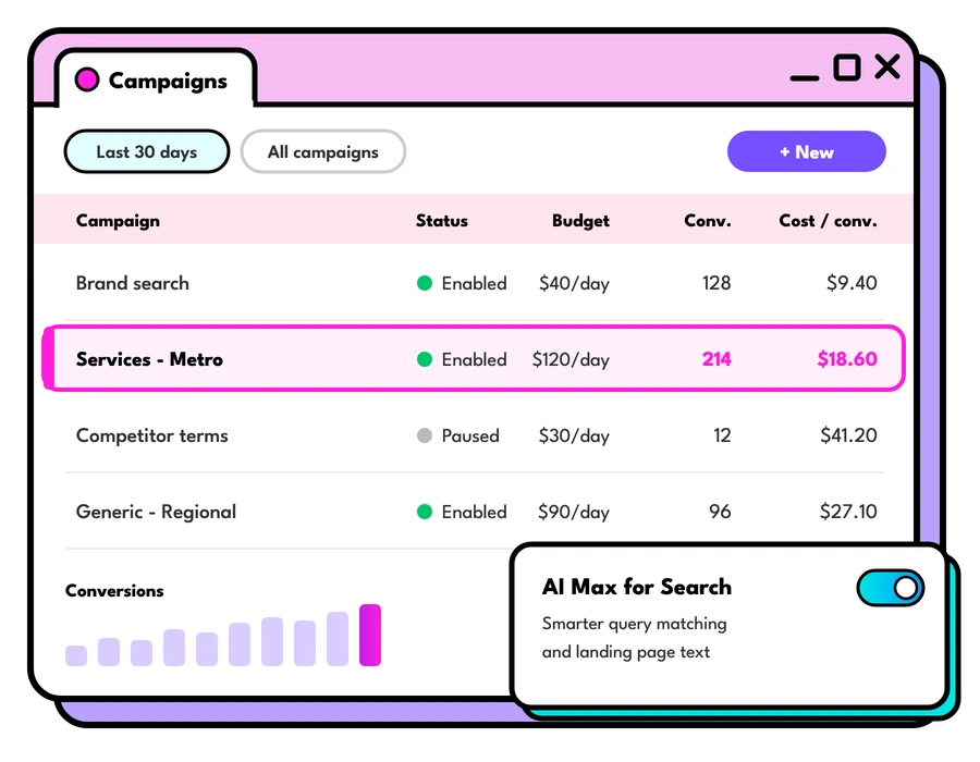
Google Ads cost in Australia
What Google Ads cost in Australia and how to set your daily budget: how Google spends it, what changes the cost per click, and where to start.
Read the guideLet's talk about your goals
Tell us what you're working towards and we'll show you where we'd start.
Book a strategy call